GraphicDesign
Wednesday 15 May 2013
Editorial Piece
Final Publication
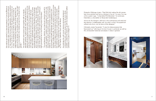
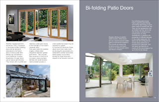
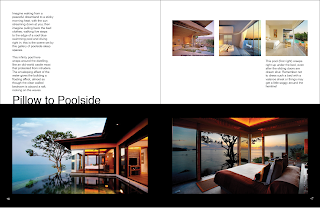
Project requirements, to produce a magazine within our chosen topic. Using a grid, baseline and a consistent design throughout.
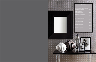
My final publication, an interior design magazine. Articles were found online related to home DIY improvements.
Wednesday 10 October 2012
The Editorial Process
Image & Text
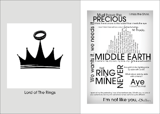
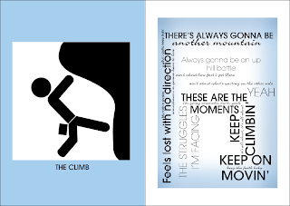
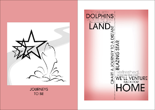
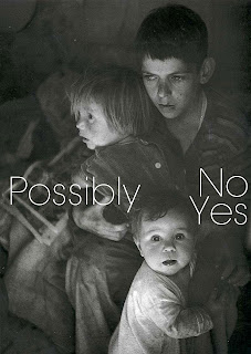
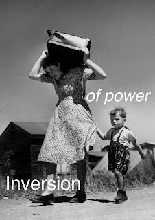
We had to produce 4 text / image combinations. These were a list of
different phrases and photographs that we were able to pick out of. However,
the last 2 photographs had to be taken by us. Each time we had to use a different
outcomes; different in terms of meaning that were....
Create an 'affirmative' / harmonious relationship between text and image.
Affirmative
Asserting that something is true or correct, as with the answer "yes"
Positive; optimistic
Create an oppositional / 'subversive' relationship between text and image.
Subversive
Intended or serving to subvert, especially intended to overthrow or undermine an
established government.
Create a 'poetic' / surreal relationship between text and image.
Poetic
Characterized by romantic imagery
Suitable as a subject for poetry.
Create 'hybrid' relationship between text and image.
Hybrid
Something of mixed origin or composition, such as a word whose elements are
derived from different language.
Something having two kinds of components that produce the same or
similar results.
Wednesday 3 October 2012
InDesign
Postcard - InDesign
We were asked to create a postcard in our InDesign work shop.
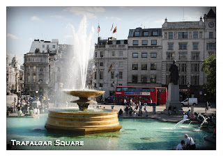
This is my final design, with some personal photograph that I have taken myself
then edited to fit a postcard style.
10 Bad Examples of Letter Spacing
As the letters within this sign are mainly long and thin. The 'O's seem too large to the
other letters, creating an big spacing within the letters 'O's,
The WG are too close together. There needs to be more spacing between the two.
There is a small gap between the 'g' and 'n', however missing in between the other
letters. This creates the belief that it is an typo than to an design.
Superdrugs. The fonts and sizing make it hard to read. However
over the years, the name has become historical, due to the style. So,
easy to pin point it on the high street.
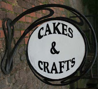
The word cakes seem's to be too far up within the circle than to the bottom
half of the sign. The spacing has not been fully thought through.
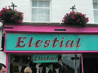
The style of font of this sign should be all joined up together, though
the letters have not been joined. The spacing should be more closer together.
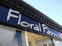
The 'o' is too far flat rounded to the other lettering. The space that the 'o' creates
spoils the rest of the characters.
There is far too much spacing within this word.
The last lettering of the word changes the overall look of this.
'Open' - 'Opew'
I really dislike when different fonts are used wrongly.
It looks really bad, either use the same font or pick one that looks good
without mix and matching.
Subscribe to:
Posts (Atom)

